Category Archives: Production

Steaming on the Stovetop

Having started several paintings, using magic sizing on the silk for the preliminary drawings, I am ready to steam set.  Here is a quick picture diary of the steam setting I am doing today:

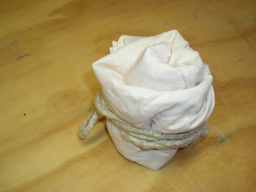
Wrapping silk in a bundle for steaming

The silk paintings have the magic sizing on them, and the preliminary drawings are dry.  There are two in this bundle I am making, separated by a layer of cotton.  I roll up the paintings and tie the bundle loosely with a soft cotton cord.

Bundle ready for steaming

Here is the bundle- ready for the stovetop steamer.  I will leave it in for at least 30 minutes.  Silk bundle inside steamerThe steamer is gently steaming over medium heat- and now I put the lid on it and let it quietly steam.  Washing out the sizing

After the steaming is done, I lift out the bundle.  Ouch!  I’ve been too hasty too many times- it is so hot!  And stays hot, as I unroll it.  So- be careful! It can burn … Anyway, now I get to give them  a light wash to remove the magic sizing from the initial painting step.  Some people use a fancy soap- I don’t care for too many chemicals.  I use a tiny drop of dish detergent.  It still may stress the silk if it is too harsh.  Adding a vinegar rinse

I add a few splashes of white vinegar to a final cold rinse, to restore the natural acidic balance to the silk, after the detergent and magic sizing.  It seems to help- it certainly restores the shine and luster.  I’ll iron these dry- or let them hand on a clothesline.  And then I am ready to begin next layer of painting.

New Favorite, Almost Didn’t Make It

Ever had a painting you started, and somewhere along the way something goes wrong?  What about getting it right again?  Saving a painting seems rare enough that I’m ready to celebrate.

Applying Color after Magic Sizing

Here it is, stage one.  I applied Magic Sizing, let it dry, and then blocked out my dominant shape.  Notice… after this moment, there are no more photographs of the painting in stages.  Yes, it went south right after this.

I added some bold green in diagonals, and a soft grey background.  The idea was to capture the shapes of the spring daffodils I had seen, in a graphic simple way.  Well, graphic and simple I got.  But the colors fought, the shapes had no rhythm, and try as I might, I couldn’t blend anything together.

I tried the usual tricks.  The muted colors floating over  a too-flat area.  The texture added in small doses.  Then in desperately large doses.  And my emergency re-boot… flipping it to use the opposite side hoping the composition will be more dynamic reading the opposite way (the benefits of dye on fabric- it goes all the way through…).  Didn’t work.  Reader, I HATED it.

It sat on a shelf for almost a year.  I got stubborn and started reworking it again, without a great deal of hope.  Actually, with no hope.  Just stubbornness.  But for some reason, it came to life again.

Daffodils in Moonlight


Water Soluble Resist Comparison

So I have recently purchased two new Dupont colors- and a new water based resist.  Not only are the Dupont dyes a challenge to order at the moment, the water based resist that I LOVE is not currently available.  Inspired by how much my old color chart helped me make sense of my studio possibilities, I decided to do a side-by side comparison with colors and resists.

First, let’s do the colors.

I concluded right away that Myrthe # 610  won’t be a favorite. Look at the first leaf shape on the left to see it.  Much too minty-green, it seems to stand out from my usual palette like a sore thumb.  Still, I had not yet paired it side by side with many of my other green dyes.  Now I see that it is vivid, but such a cool green.  Still not a favorite.

Citron # 626, new for me, goes head to head with Helianthe, my big favorite.   The middle yellow leaf is Citron, the flanking ones are Helianthe.   Citron is slightly paler, and cooler.  Yet the intensity is holding its own against Helianthe. A very pretty shade.  Not bad!

Now for the resists.

Wow, I do not have too much to say for Jacquard Water Based Resist.  The leaves and linear work on the right portion are the Jacquard resist.  The ones on the left half are made by Silkpaint resist.  Both were in a squeeze bottle with a medium (.07mm, I think) applicator tip.

The Jacquard resist just cannot make a thin line, not much thinner than 1/8 inch , and is very hard to control. I let it dry until it was not transparent ( it continued to spread quite a bit) and then applied dye.  It absorbed dye at all the edges, giving a furry look.  Had I waited until the next day, I am sure the resist would have been sturdier.  But I do not time my work that way.

In some places, like the lower right, the dye completely absorbed and broke through.  This may not be a completely bad thing- it does give a very pretty layering effect, and looks very much like crackle batik.  But the Jacquard resist usefulness is very limited.

The Silkpaint brand resist line is very thin, though I could control the flow by squeezing the bottle, and get a thicker line.  I waited only a few minutes after applying the resist to dye, and the resist did hold a sturdy line against the dye.  In places, it did  absorb the dye, though not as much as the Jacquard resist.

As far as rinsing the resist away after steaming, both resists washed away easily.  I steamed the piece for 10 minutes in high heat and heavy steam, turned the setting to low heat with steady steam for 25 minutes, and then let it cool in the pot for 10 minutes.  So the resist was exposed to high heat and a long steaming time, but with no ill effects whatsoever.  Rinseability was fine.

I think I will use the Jacquard for broader effects, more splotchy and abstract, than what I usually try with resists.  For linear work I want the Silkpaint resist!  I hope it will become available soon!

New Dyes From DuPont

Painting in progress showing new Dupont color

New dyes arrived in the mail last week, so I am giving them a try.  Actually I am out of my FAVORITE colors so I don’t have much of a choice!  “Myrthe” # 610 stands in now to replace my beloved “Vert Feuillage” #620.  The result- you can see a bit of difference with the small splashes of the Vert Feuillage in some pale leaves around the cat.  The Myrthe is the bright vivid dye on the outer shapes.  It has dried since this photo to a minty, cool green.  I’ll try to get a truer photo tomorrow.  Totally not satisfactory to replace my big favorite.

Also in this photo, but harder to see, I am auditioning “Citron” 626.  I like it so far, but fortunately for me, it does not have to replace my other favorite, “Helianthe”, as it seems to be available from Dharma.  Last week they did not have it.  As Dharma said on it’s website, “DuPont is a mess.”  Ordering seems to be a bit crazy.  I’m hoping for some more choices in the vivid green department.

Tending and Mending

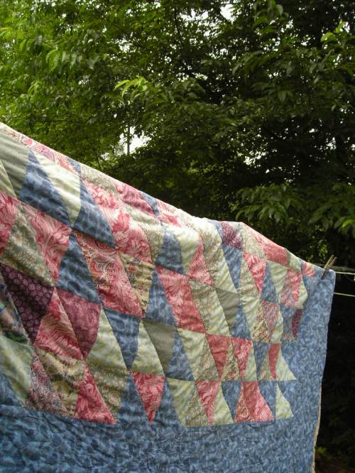
Quilt dries on laundry line

After washing and drying my favorite handmade quilt, I discovered a hole in the quilt top.

A mistake … revealed years later In some places my seam allowance was too skimpy!  And now years later a piece has pulled loose.

A good decision… revealed years later.  I saved small scraps of this quilt top, for years in my fabric stash.  So I had pieces of the original fabric with which to mend.

After much deliberation back when constructing this quilt, I decided to machine piece the top, and hand stitch the quilting.  I have never regretted this- I think the machine stitching gave the quilt strength and the hand stitching gave it texture.  The texture has developed over the years into something really nice- so I do not regret the massive time it took to stitch!

I have always loved the Liberty fabrics I was fortunate enough to use for some of this quilt.  I bought pieces of it- as much as I could afford, which was a TINY amount- back when I was a student in St. Louis over twenty years ago.  I have searched out Liberty quilting fabric since then.  Yet it seems different.  Mine had such a wonderful hand that the cotton feels like silk.  Can anyone tell me if I can still get Liberty fabric with that same feel?  Perhaps the thread count has changed, or another finishing technique.  Anyway, I’d be interested to know what others have experienced as far as Liberty cotton then (way back then) and now.

Pick Up the Pace

Four paintings a month.  That is my progress… for about a year.  Really,  I have had no particular complaints about this in the past.  And the creation and participation in the creative process– that is the important element for me.  Selling my artwork is not my FIRST priority.

Actually to tell the whole truth,  I have had a protective attitude towards my silk painting process.  I know all too well that forcing a creative project to become a commercial endeavor has dangers for the creative process.  Simply put, it can suck the life out of it.  Make it stale.  Repetitive.  Not life affirming, but something to dread.

Recently, I’ve realized that there might be an up side to commercial participation.  Yes, money of course.  But beyond that, affirmation.  Approval for works done well.  The freshness that comes from a quickening practice.  Interaction with peers- and learning from those who produce works very well.  All of this seems to contribute to the creative process, not necessarily tear it down.

So this awareness is coming to me at just the right time… I needed some freshness.  Help for a creative process that had become sluggish.

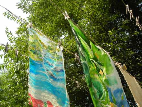
Blistering July morning air dries silk paintings in progress.

All of this is to say- it’s time to pick up the pace.  I’m attempting to raise the production past FOUR.

Has anyone tried this in their own silk painting production?  Or other creative endeavors?  I think there will be a lot of habits that will need to change, and learning that will have to happen.  I’m interested to hear advice from anyone willing to help me on this path!

Steaming in progress

Time to steam my latest efforts.  I’ve bundled them in newsprint, tied the bundle, and will steam them on the stove top.  I always look forward to finishing the steaming.  The colors looks so vibrant when it has been done.

Silk Painting Started

A new painting begun- inspired by an outing to a nearby river.

Sketching- The Spark that Lights the Creative Fire

Sketching has assumes a new importance for me lately.  Perhaps it is because I am approaching my paintings more slowly and carefully lately.  Perhaps it is because I am examining each building block of the creative process before the end result has become complete.  Or maybe I am more interested in the creative process itself lately.

Here are two sketches that have been useful for me this week as I begin a few new paintings.

To Wrap Up… Playing with Magic Sizing

Have you ever been happily at work on a project only to bog down just before completion for no apparent reason?  Well, that is what I did here, while at work on this last post on experimenting with new techniques.  So sorry!  That feels so frustrating!  But here is the last installment, as I try to wrap things up on this.

The completed painting , above, started with color-blocked shapes on silk that I prepped with Magic Sizing.  This allowed me to use a large brush and work in the tree scape, the river, and the sky.  I also put the shadowed side of the rocks down as well.  At this point I steamed it, rinsed it, and went to the next stage.

Stage two began with some gutta lines to define shapes within shapes.  You can see the gutta lines over the initial shapes, in the upper tree area.  I could get more color contrast in the water, and in the grass.  I did move on to several other steamings on this, but most of it took shape in stages one and two.

In this one, I mixed my “two techniques” freely… the Magic Sizing prepped silk and the gutta resist method, that is.   And in this one I really learned some mark making vocabulary with the Magic Sizing technique…

I LOVED the marks that resulted from spaying a second coat of Magic Sizing into still-damp dyed silk.  Look in the upper leaves of the trees to see the blotchy marks of green-on-green.  The photo loses some of the smaller, more textured marks abound the bigger ones.

Not as thrilling was the jagged edge that formed slowly (tricky, because you think you are home free, and then look later and there it is) on edges of shapes where I used more water than necessary.  The Magic Sizing prepped silk is tricky like this- the initial strike with the dye on the damp brush looks perfect.  And then water (and dye) is drawn into the surrounding shapes slowly.  You can see where I made this mistake- see the bottom of the rock to the right.

In this one I used gutta to block out the shape of the blue jay, and after the gutta dried I used Magic Sizing on the silk.  Then I blocked in the big shapes.  After a steaming I started layering the water, using the gutta to block out the river area, and then painting wet-into-wet for the watery effect.  After every thing else had been completed and the silk steamed once again, I used the magic sizing again and put in the details of the blue jay’s markings.  So I went back and forth with the techniques on this one.

I am so grateful to everyone who helped me learn about this-  Karen Sistek, Francine Dufour Jones, and others who have posted information to share their knowledge and skill.  In my previous post on this topic I have a few links to information they have posted.  This has been an exciting topic to explore- thanks to all who have helped me!